Saturday, March 19, 2011

Photo Editing- Colors and Contrast

Here are a couple of my photos, edited in Photoshop. I found a few things- one is that my eye likes black and white and I always think things look better that way. Also, in terms of color, I liked giving photos an old 80's tint to them- probably because some of my favorite family photos are in that tone. I always found that I really don't like things over-saturated or over-exposed. It was also helpful to use the masking layers in order to put effects on the original photo.

This is the original photo.


This is the final- I tweaked a lot of things in it. Mainly levels, brightness and contrast, saturation and a cool-toned filter.


I took this photo yesterday- sledding in the BC back country.


This is the edited version. I changed it to black and white, adjusted the levels and contrast and put a warm-toned filter on it.

Friday, March 11, 2011

Photo Editing Practice

So, for this assignment I realized a couple things. The first was that I have no patience when selecting things and that my expectations for poor Photoshop are far too high. I kept just wanting it to "know" what I wanted selected, and figured out after a while that using a variety of selection tools on one project can help quite a bit. Also, Lisa's and this Adobe TV tutorial on selecting really helped A LOT-

I found his trick of painting within a selection really helpful, especially when I was dealing with selecting fine points. My selections are definitely not perfect, but I plan on practicing a lot more in the future!


This is one of the images I started with, taken on the top of half dome in Yosemite.


I added a picture of a heli coming to pick us up...wouldn't that've been nice..I also tweaked the color balance, saturation, shadows and contrast to try to make the end result look a little more realistic.


This is the original picture that I used. I took it of myself in a plane in Alaska. Behind me is the Rainbow Glacier in Glacier Bay National Park.


This is the edited version. I cropped out the glacier and put in a photo from Hawaii and my boyfriend being weird. I also manipulated saturation and contrast.

Friday, March 4, 2011

Landscape

I really enjoyed learning about landscape this week and had a great opportunity to go practice my newly acquired skills. We had a beautiful powder day at Mount Baker and I got to capture the North Cascades in all their glory. I also threw in a couple favorite shots from Chile to add a little color to the collection.

This is an early morning shot of the lodge with the looming Mount Shuckson behind it.


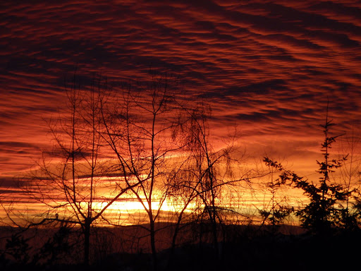
This is an extra photo I threw in, taken in Chile this summer. The sunset was gorgeous but which can unfortunately can be credited to loads of pollution in the city below.


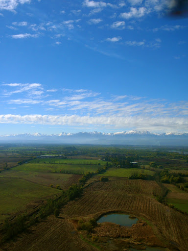
This is another extra from Chile that I like because to me, it really says "landscape". The cool thing about it is that it was taken through fiberglass out of helicopter.


This is the view from the tops of the ski resort last week. I feel like I've got a lot to learn about how to use the sun to your advantage when your shooting into it.


This is a little wind lip that my friends were playing around on. I liked the contrast provided by the shadows, forming a line down the middle of the photo.


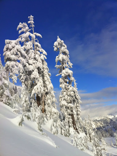
Frozen alpine trees!


Here is a view of the Casacade mountain range with the clouds rolling in at the end of the day. I changed it to B&W in Picassa in order to give it a stormy mood and accentuate the contrast of the scene.


This was taken pretty early in the morning, our first hike out. I feel like I would've liked to change the angle a little, highlighting the tracks in the snow.

Saturday, February 26, 2011

Framing Assignment

 This was my first timing ever hearing about or learning about the rule of thirds.  It was really interesting to look through my photos and recognize that the ones that were most appealing where those using some kind of framing tool.  I definitely found that I like some where the subject was centered, as it emphasized the message or idea of the photo. 

Monday, February 21, 2011

Color Scheme Assignment

For this week's assignment, I decided to use some of my photos from living in Haines, Alaska.  I've been having a bit of nostalgia lately for this amazingly beautiful place and the seasonal colors are astoundingly different due to the heavy year round precipitation. 


This is a photo I took hiking in the summer.  I thought it was a great example of an analogous color scheme, with the main colors being blues and green. 
This photo was taken heli skiing on a glacier. We were waiting for the heli to lift and come pick us up.  To me, it exemplifies a complementary color scheme with the bright blue and red. 

Thursday, February 10, 2011

Macro World


For this week's assignment, I took a bunch of macro photos using my SLR camera.  It was a blast and gave me a new way to look at the world. I think photos like these are what my albums have been missing!

Monday, February 7, 2011

Bali Bunny

For this week's assignment, I shot tons of different angles of a of a loco-looking wooden bunny carving from Bali.  He was hanging out in our backyard on a rare sunny day in Bellingham.  I found that the ones I liked the best where the photos that brought the bunny to life, so it speak.  The most attractive ones where the photos that lured you in, made you wonder what that crazy bunny was looking at.  I also liked the photos that where just grass and bunny, without any distracting background.  I found that different perspectives really changed the message of the photo and made it either interesting or blah.   I used both my point and shoot and SLR, and much to my dismay, the point and shoot came out better.

 Bunny is just playing in the green grass on a sunny day.  I like this pic because of the colors and I feel like the angle and framing gives the figure a life-like vibe.

 I like this photo, but not as much as the previous one.   I found that close up, straight on was a good way to show the detail of the carving.


I took this photo from behind the craving, trying to make bunny look like he was staring off into the yard.  It sort of worked.  On this one, I really learned about the importance of remembering to include the shadow as part of the composition.